March 15, 2026
How to Read a Graph Without Being Misled
Graphs are meant to make information clearer, but the way they’re designed can just as easily distort the story. For students, teachers, and even adults, it’s surprisingly easy to be misled by a graph that looks convincing but hides important details. Understanding how scale, truncation, and visual bias work helps learners read graphs critically - a key skill in maths, science, and everyday life.
1. How Scale Shapes the Story
The scale on a graph determines how steep, flat, large, or small something appears. A change in scale can make a tiny difference look dramatic, or a major shift look unimportant.
What to watch for
- Uneven intervals - when the spacing between numbers isn’t consistent.
- Compressed scales - large ranges squeezed into a small space, flattening trends.
- Expanded scales - small ranges stretched out, exaggerating changes.
Classroom example
Two graphs show the same temperature change: from 18°C to 20°C.
- One uses a scale from 0 - 40°C → the line looks almost flat.
- One uses a scale from 18 - 20°C → the line looks extremely steep.
The data hasn’t changed - only the impression.
2. Truncation: When the Axis Doesn’t Start at Zero
Truncation happens when a graph’s vertical axis starts at a number other than zero. This is common in media and advertising because it makes small differences look huge.
Why it matters
- A bar that looks twice as tall might only be a few units larger.
- A tiny change can appear like a dramatic jump.
- Students may assume the visual height reflects the true difference.
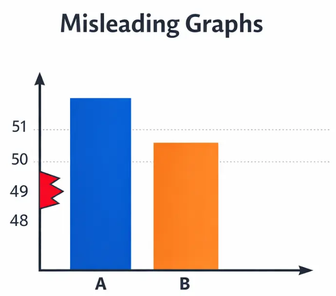
Example
A bar chart comparing two values:
- Value A: 51
- Value B: 49
If the axis starts at 0, the bars look almost identical. If the axis starts at 48, one bar looks massively taller.
This is a perfect opportunity for students to question: “Is the graph showing the whole story?”
3. Visual Bias: When Design Choices Influence Interpretation
Even when the scale is correct, design choices can nudge the viewer toward a particular conclusion.
Common sources of visual bias
- 3D effects - distort height and make bars look larger than they are.
- Images instead of bars - icons (like stacks of money or people) can exaggerate size.
- Colour choices - bright or bold colours draw attention to certain data points.
- Uneven spacing - inconsistent gaps between bars or points can imply patterns that don’t exist.
Why this matters for students
Visual bias teaches students that graphs are not neutral. They are designed - and design can influence interpretation.
4. A Simple Framework for Students: “Stop, Look, Question”
A three-step routine helps students read graphs critically:
- Stop - Notice the type of graph and what it claims to show.
- Look - Check the scale, axis starting points, spacing, and labels.
- Question - Ask whether the visual impression matches the actual numbers.
This builds statistical literacy and encourages students to think, not just accept.
5. Why This Matters Beyond the Classroom
Graphs appear everywhere: news articles, social media, advertising, political campaigns, and scientific reports. Students who can read them critically are better equipped to:
- Spot misleading claims
- Understand real trends
- Make informed decisions
- Question the way information is presented
In a world full of data, this is a life skill. 🌈✨
Leave a Comment
Please note - comments need to be approved before posting.